Design that sells the idea fast.
Here’s a look at the kind of brand, web, and creative work I build. Each project is designed to be unique to the client and shape how their presence feels, functions, and is remembered.
All visual identity highlights.
Logos, badges, packaging, ads, and interface visuals designed to stand out, hold up, and perform in real-world use.
This category is on deck. I’m building out public-facing examples here, but the work is already happening behind the scenes.
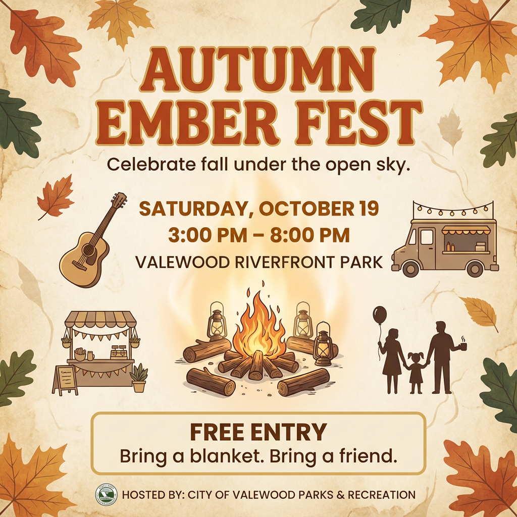
Autumn Ember Fest
Seasonal social media and print flyer designed to promote a community fall event with clear information hierarchy and warm, approachable visuals.
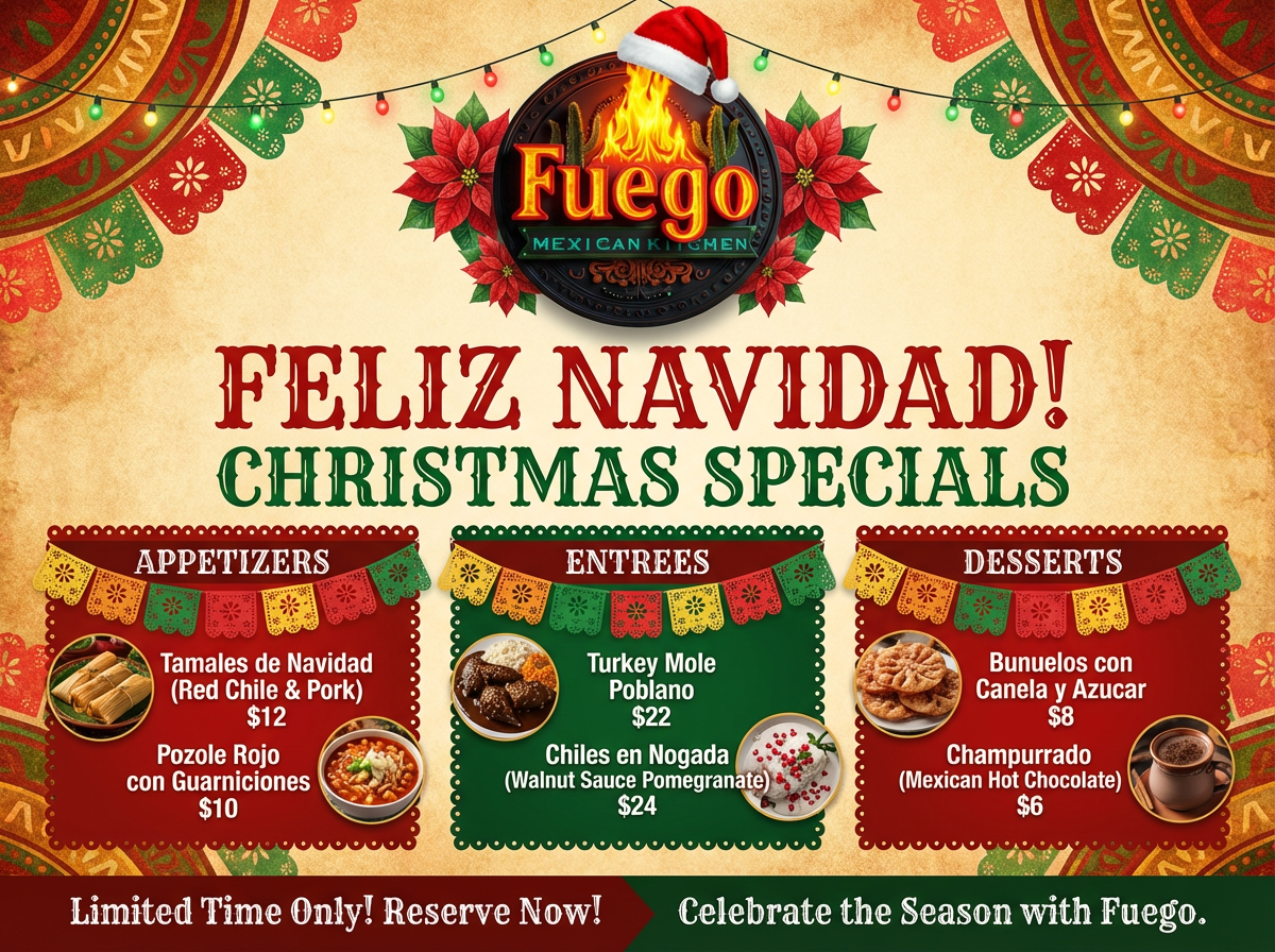
Fuego Mexican Kitchen — Christmas Specials
Holiday promotional flyer created for a restaurant seasonal menu campaign, combining festive visuals with clear menu presentation and pricing.
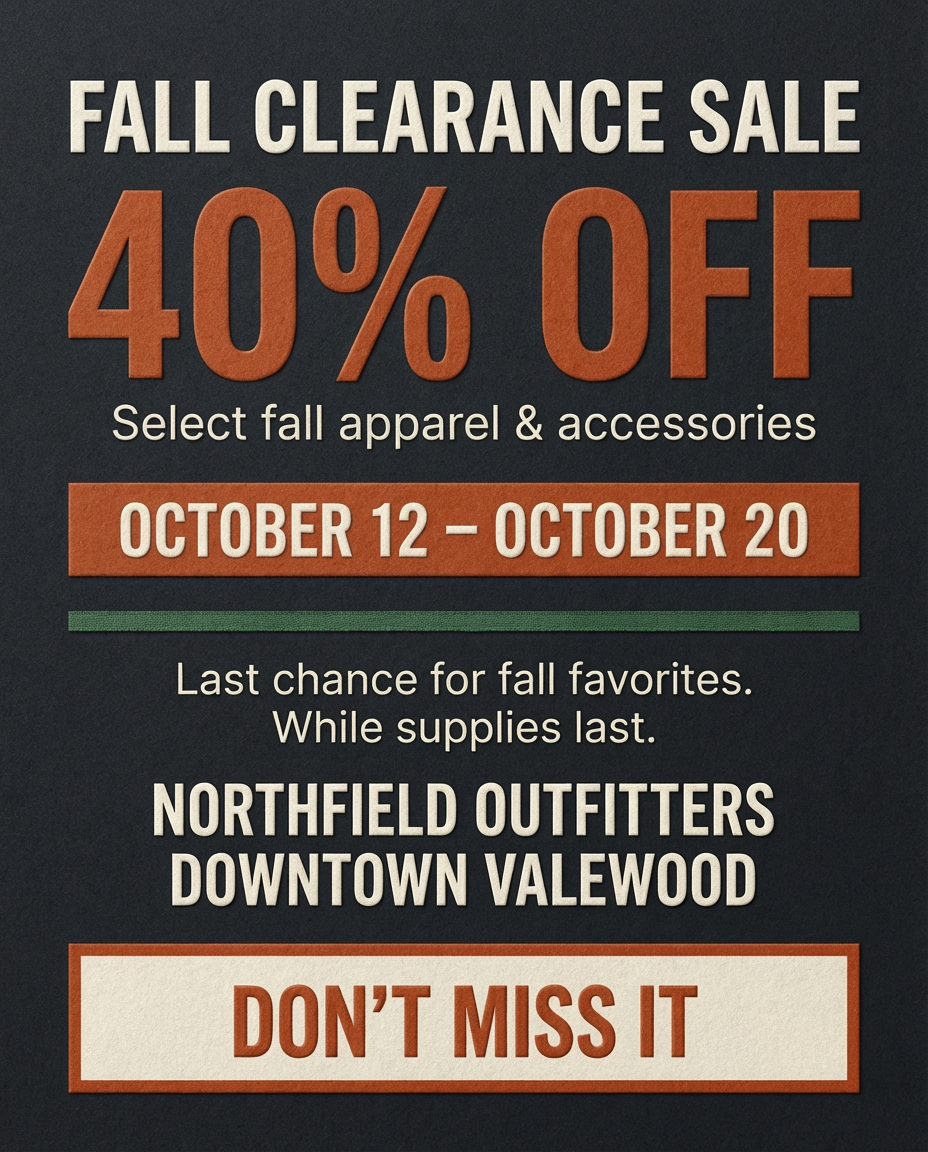
Northfield Outfitters — Fall Clearance Sale
Retail promotional flyer designed to drive in-store traffic with bold typography, clear discount messaging, and a focused seasonal color palette.
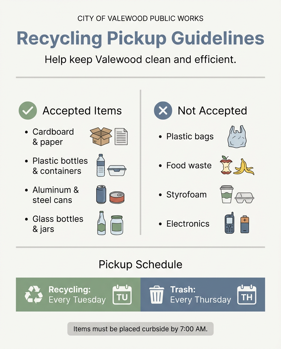
City of Valewood — Recycling Pickup Guidelines
Clear, easy-to-read public information graphic designed to communicate recycling rules and pickup schedules for residents.
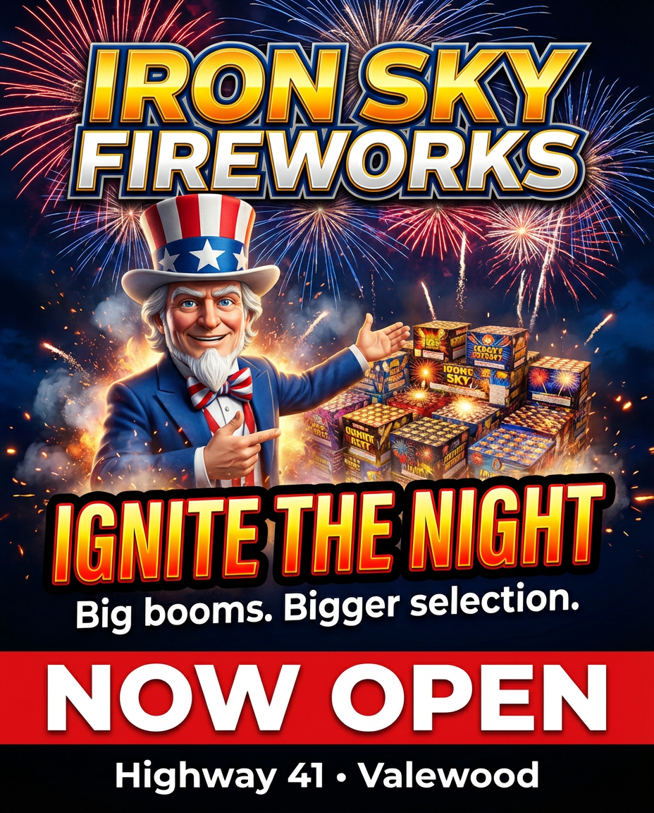
Iron Sky Fireworks — Grand Opening
High-impact retail graphic designed to promote a fireworks store grand opening with bold visuals, strong color contrast, and immediate call-to-action messaging.
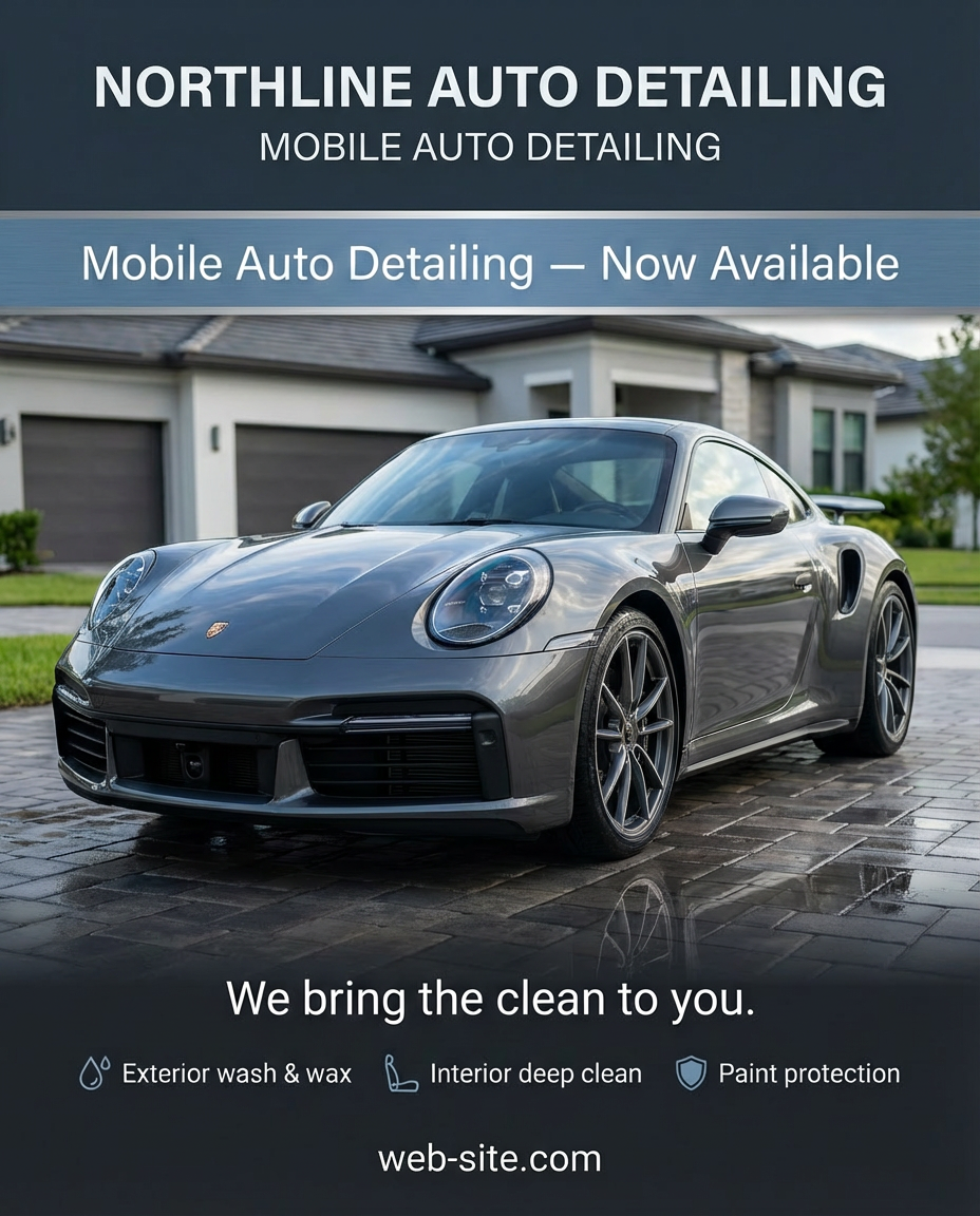
Northline Auto Detailing — Mobile Service Launch
Service launch graphic created to promote a mobile auto detailing business with a clean, professional aesthetic and clear service highlights.
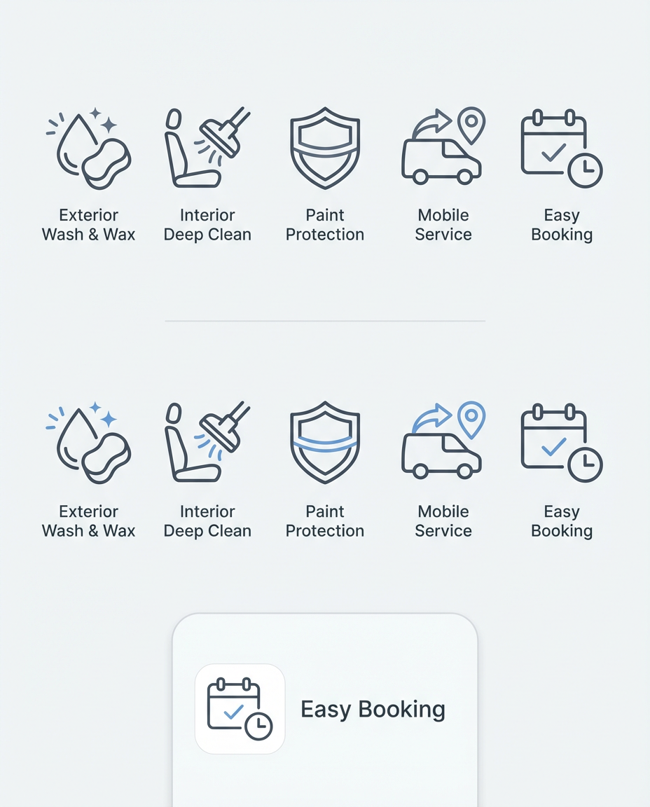
Northline Auto Detailing — Service Iconography Set
Custom line-based icon set designed to visually represent core services and features within a mobile auto detailing interface.
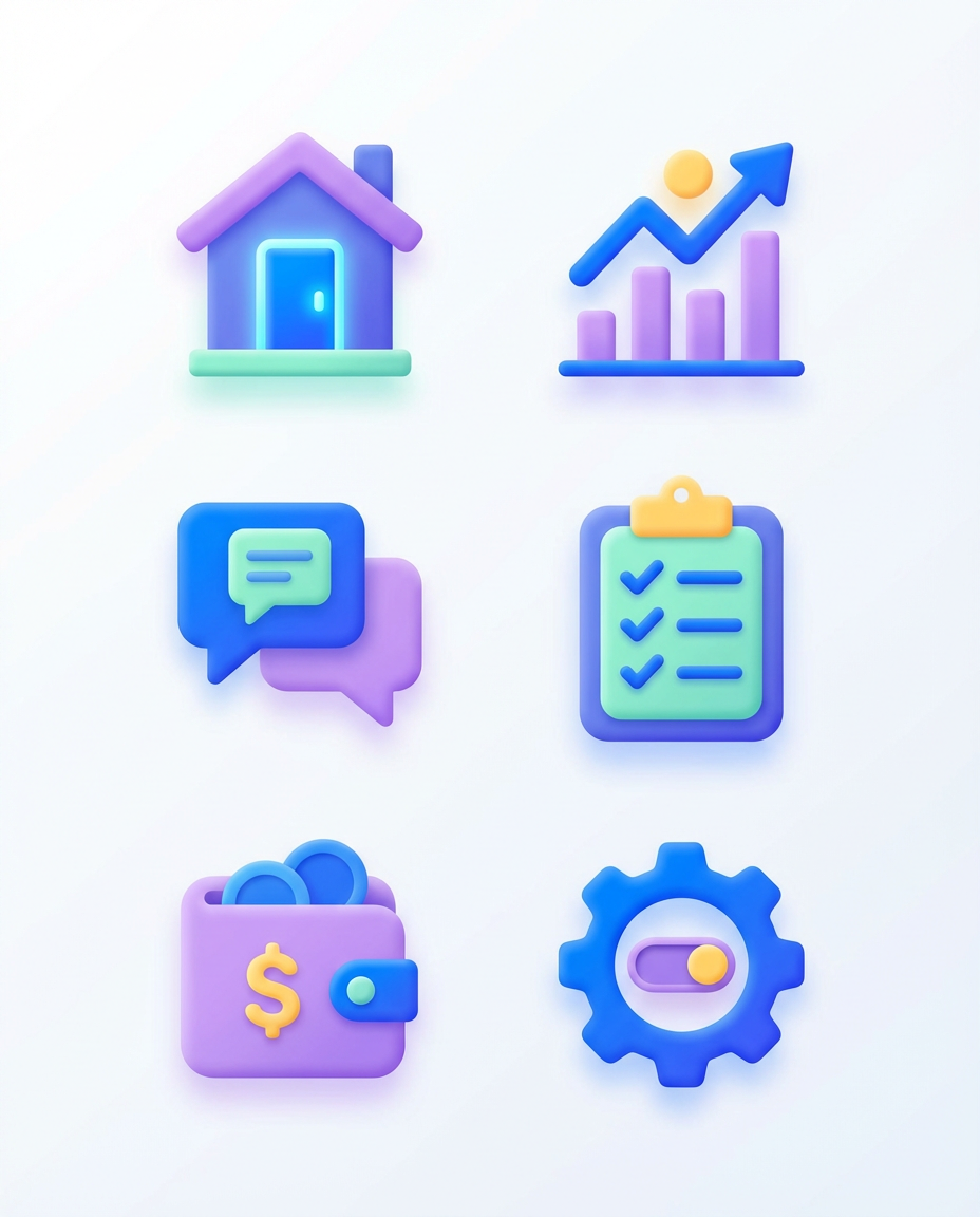
Expressive UI Icon Set — Consumer Dashboard
Expressive, high-contrast icon set designed to add personality and visual feedback to modern consumer-facing dashboards and control panels.
Northline Digital — Modern Digital Brand Identity
Digital-first logo built around navigation, direction, and precision, designed to represent clarity and forward momentum in modern digital systems.
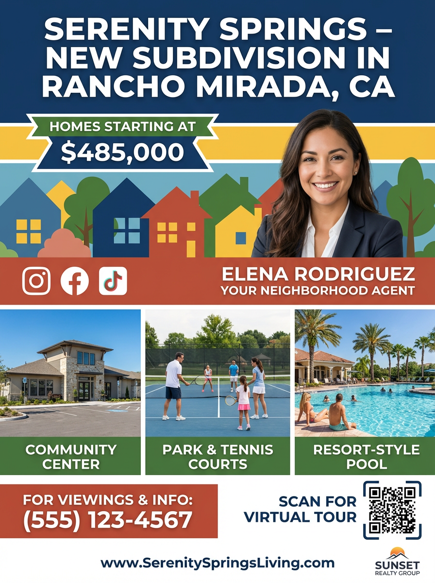
Serenity Springs — New Subdivision Promotion
Real estate marketing one-sheet designed to promote a new residential subdivision with clear pricing, amenities, and agent branding.
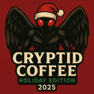
Holiday Coffee Lid Badge
Seasonal promo badge used across limited-run packaging and campaign graphics for a winter coffee release.
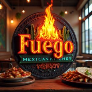
Fuego Mexican Kitchen
Restaurant logo study built around warmth, flame, and a clean wordmark that reads well on signs and menus.
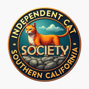
Independent Cat Society – SoCal
Community-oriented badge mark for a cat rescue group, tuned for small stickers and social avatars.
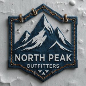
North Peak Outfitters
Patch-style logo for an outdoor brand, designed to translate well to fabric, tags, and simple product marks.
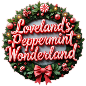
Loveland’s Peppermint Wonderland
Holiday coffee logo tuned for bag art, thumbnails, and simple one-color use when needed.
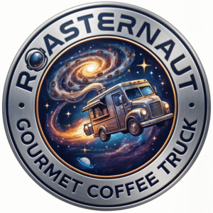
Roasternaut Coffee Truck
Mobile coffee brand mark with a retro space theme, designed to read quickly as a truck graphic and social icon.
Sure-Lock Homes Storage
Service identity using a subtle detective theme, built to sit next to simple UI and basic printed materials.
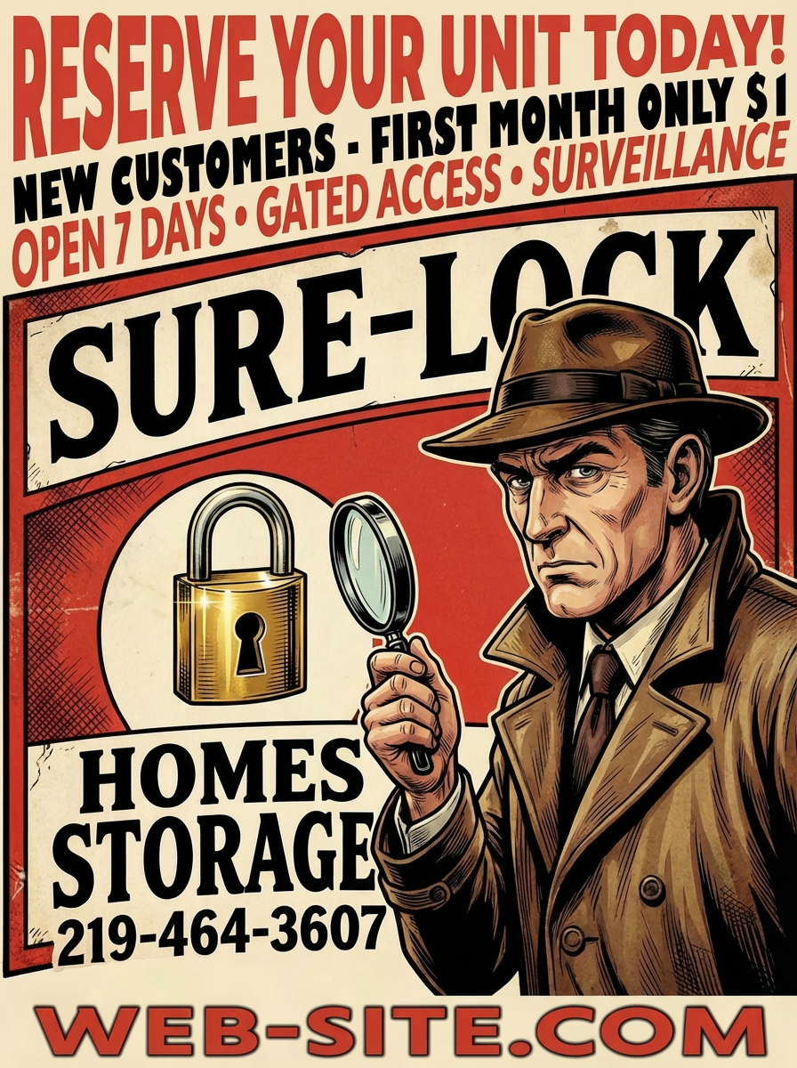
Sure-Lock Homes Storage Flyer
Print-first layout that keeps the logo central, guides the eye through key info, and leaves room for scannable actions.